UI DESIGN & DESIGN RESEARCH —
Grouper, a white label school organization web app.
MY ROLE
UI/UX Designer & Researcher
TIMELINE
1 Week

Grouper, a white label school organization web app.
UI/UX Designer & Researcher
1 Week
Entering University is an incredibly exciting whirwind for new students but it’s difficult to get accustomed to the information overload one will face when entering a new environment. As a student myself, I remember having a particularly difficult time with information on clubs and events when at orientation.
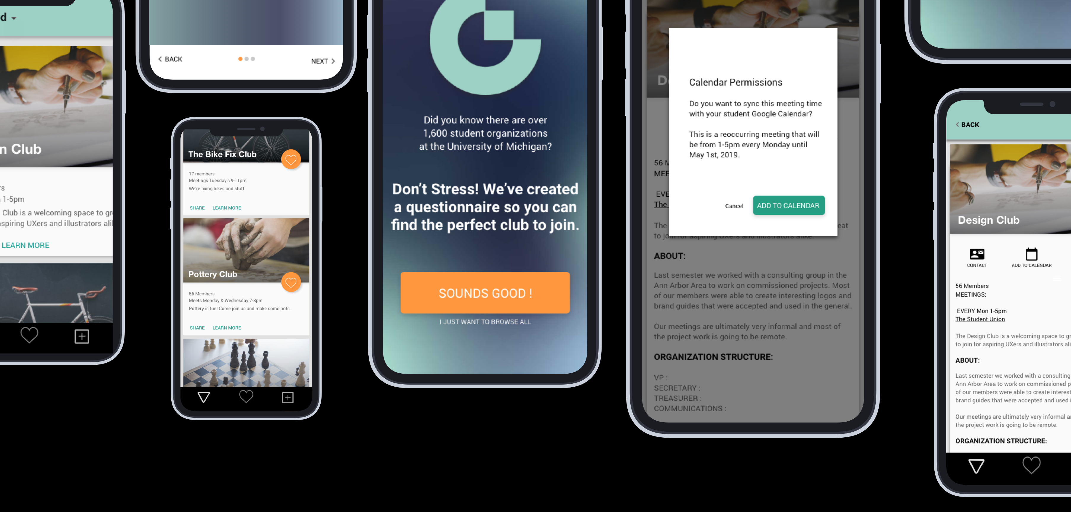
Grouper is a digital experience for new students to discover, browse, search, and propose new student organizations right from their own device.
Click through my Invision prototype to take an interest quiz, browse groups and discover events happening on campus.

How can we help students orient themselves and connect to their new university community?
What are the main hurdles in joining a club?
I interviewed 6 students on how they discovered events and started organizations (if they had an app or website to guide their process). Some people saw websites centralizing information, but most relied on university emails and facebook searching.
Meeting new people is an important part of college but the jump in discovering organizations to then balancing meeting times and events is not streamlined and confusing. I concluded three problems that I would like to tackle through this experience design exercise.
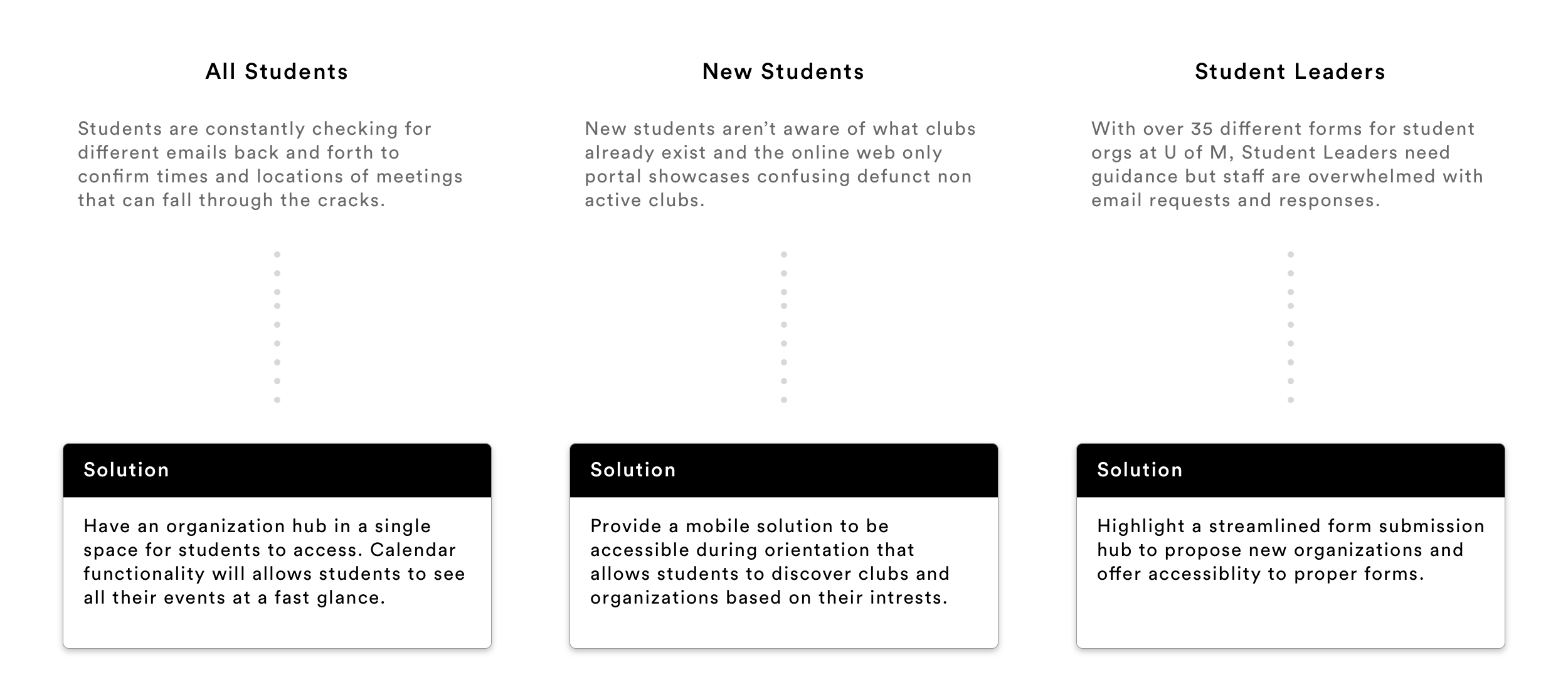
From here I decided to design something that works like a personalized experience to help students get through the process of finding and joining organizations easier, and make it possible for students to maximize their time. Through the Club View, I want to achieve two purposes: 1. Make it easier to see meeting times and add events to personal calendar and 2. Make it easier to discover new clubs and events available to members and non-members.
In recent years, the assignment system Canvas has been adopted into the workflows of students across most major universities in the US. They allow customization and provide services to hundreds of universities. Their large scale gives them resources to craft a better experience for students than a system an individual school could build itself. I designed Grouper to do the same.
In deciding what platform I will design the experience on, I thought about the different ways universities may adopt this product:

After these considerations, building an adaptive web app came out as the best option because It can be embedded into these schools' existing mobile apps and websites, since light student use wouldn't warrent the development of a native app.
Once part of an organization, it’s definitely more efficient to fill out forms and evaluate other members and activities on a larger screen. But while students are on the move, it’s easier to use a mobile app/site to check the times, discover groups and locations of meetings from the palm of their hand.
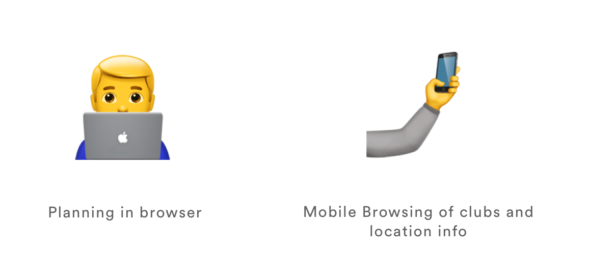
Although the two platforms are equally important, the mobile experience needs more attention on designing a solution that helps students to find these organizations on a device that they have access to, so I decided to start with the mobile screens.
Users can use their mobile phones to access accurate information about clubs and how to add it to their calendars along with simple navigation of the huge number of opportunities available. They can also fill out the correct forms to organize a new club or organization.
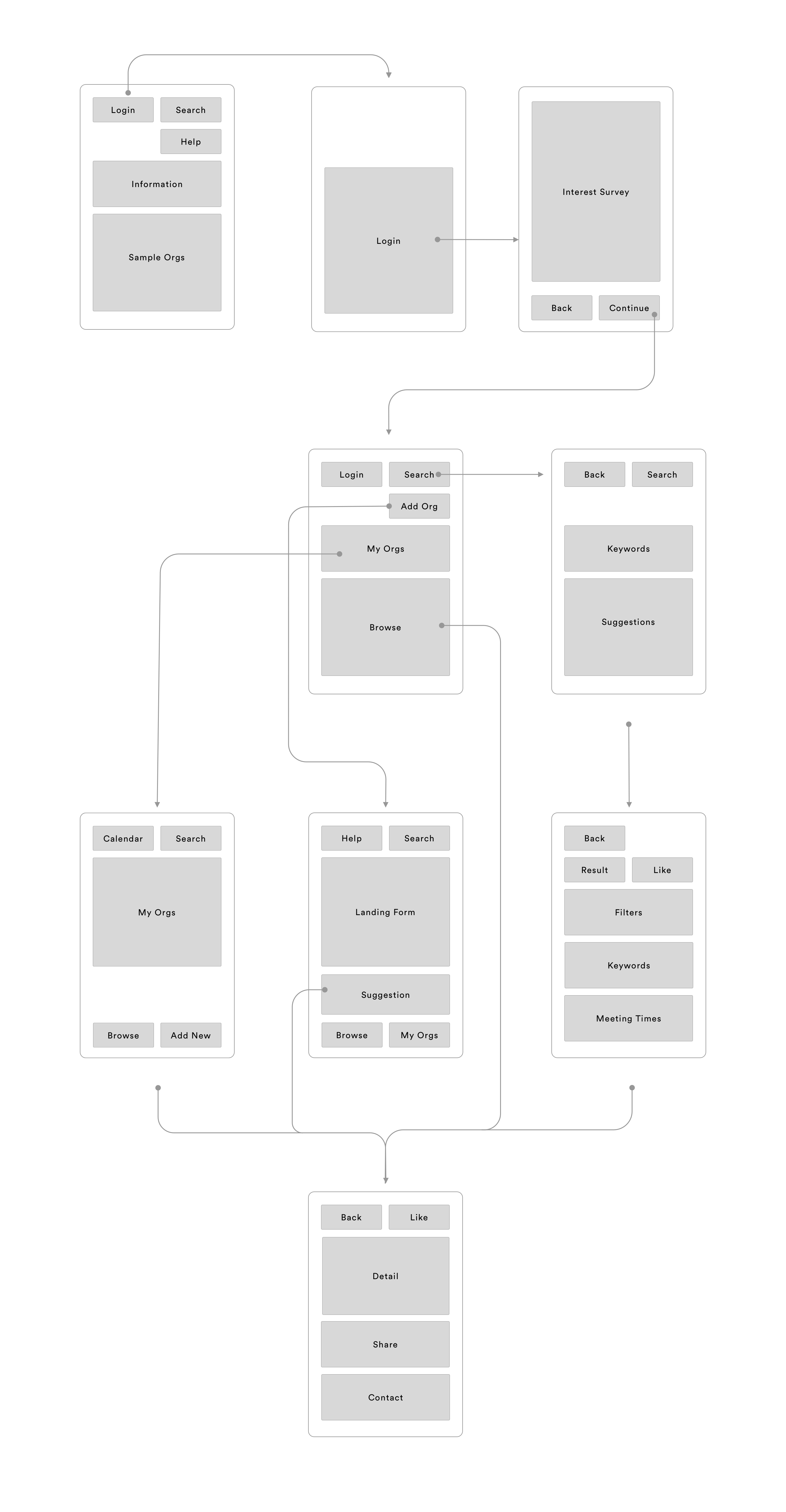
I designed the system to be as flexible as possible so that Universities can customize the color of their application. Although colors are flexible, for legibilities sake, fonts should stay the same.
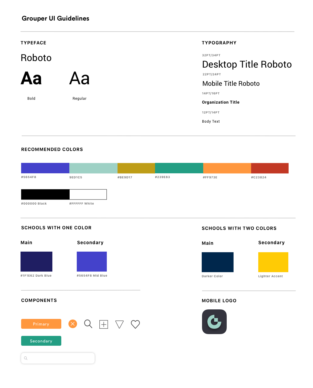

Grouper aims to make learning about and joining student organizations as intuitive as possible
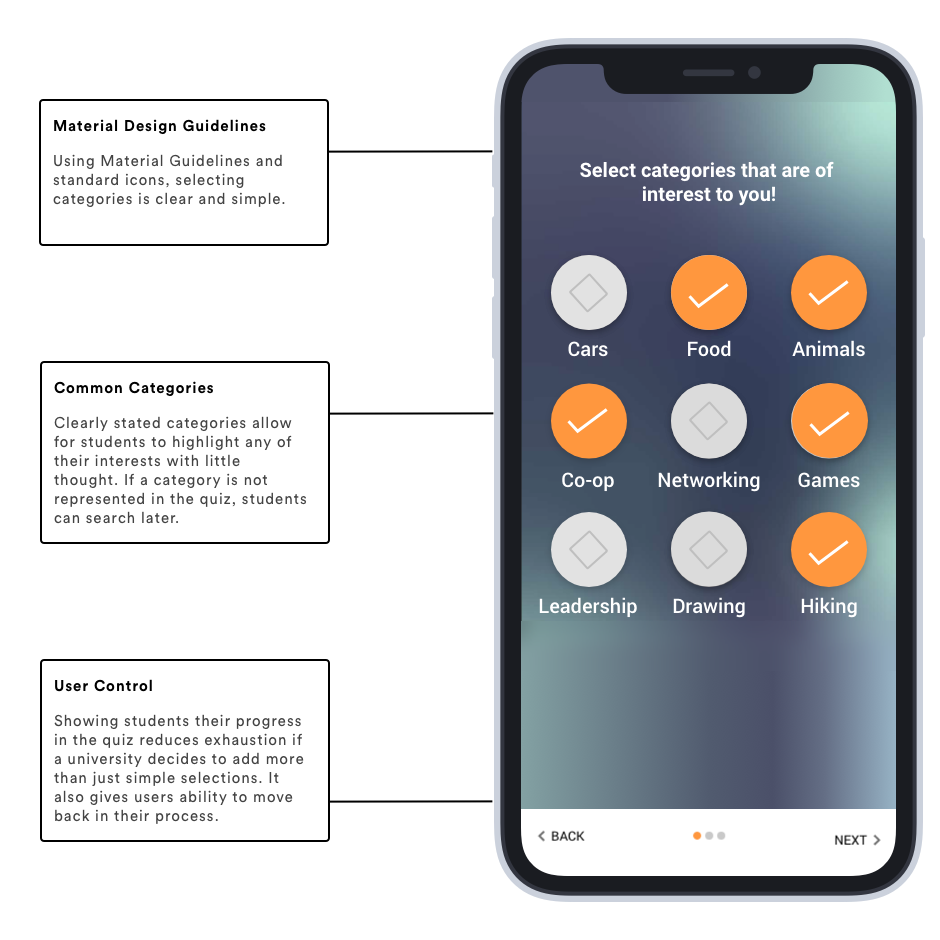
From my interviews on how students discover clubs, students were overwhelmed at the sheer number of clubs and found the search query to be too simple for the multitude of groups. For other smaller schools, overly specific searches lead to little to no results given. If students fill out a personalization assesment before viewing the clubs, it offers directions and suggestions that are applicable to the interest of students.
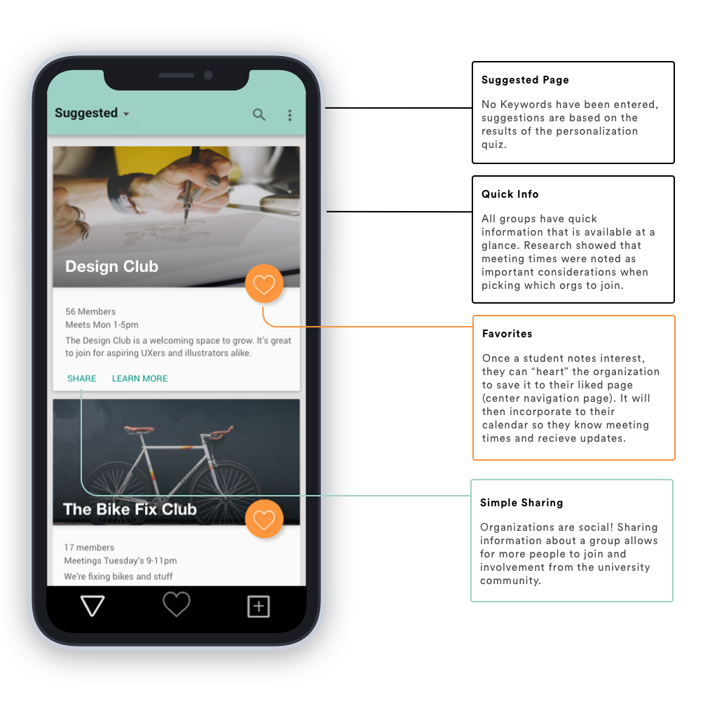
The suggestions page allows for students to get a curated suggestion of clubs based off of their answers to the personalization quiz. Liking individual clubs will move them to the favorites section of the app. Liking will also add the clubs determined calendar meetings to the students own calendar.
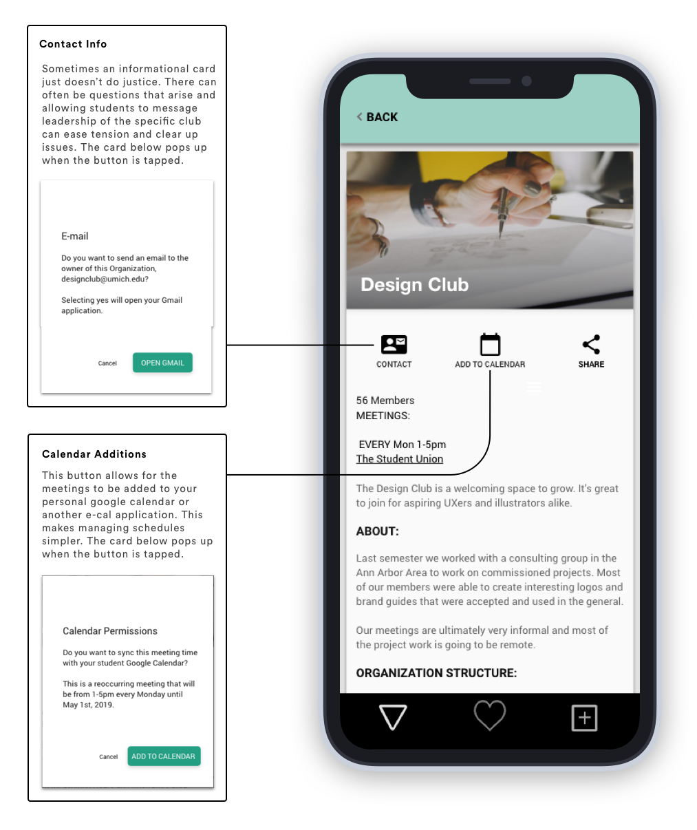
Joining a club can be complex and confusing if you don't have the most up to date information. Joining on this app makes it simple because each org has their own page where they can update the information so that potential members can understand when they meet, their requirements and if it fits into their academic schedule.
What I learned:
Creating an organization was an approach that I thought would fit well within this web application but unfortunately due to time, there is only a low-fidelity mock up of the form submission process (which you can see in the Invision prototype at the top of this page). Though critical to the existence of clubs, finding and thinking about the process of joining a club was most pinnacle.
Due to the fact that this project was a seven-day design exercise, the design decisions were made based on experiences of my interviewees and myself. Real data would suggest information such as “How many clubs do students actually join during university years?”, "What forms do students need to fill out?" and "How personalized should individual club pages be?"
On the school side, I did my best to design a flexible system to fit different schools and club types, but actually discussing this approach with different schools to understand their needs and challenges could validate some of my assumptions or find out limitations.