Happy Pod offers a stress free space for high stress populations.
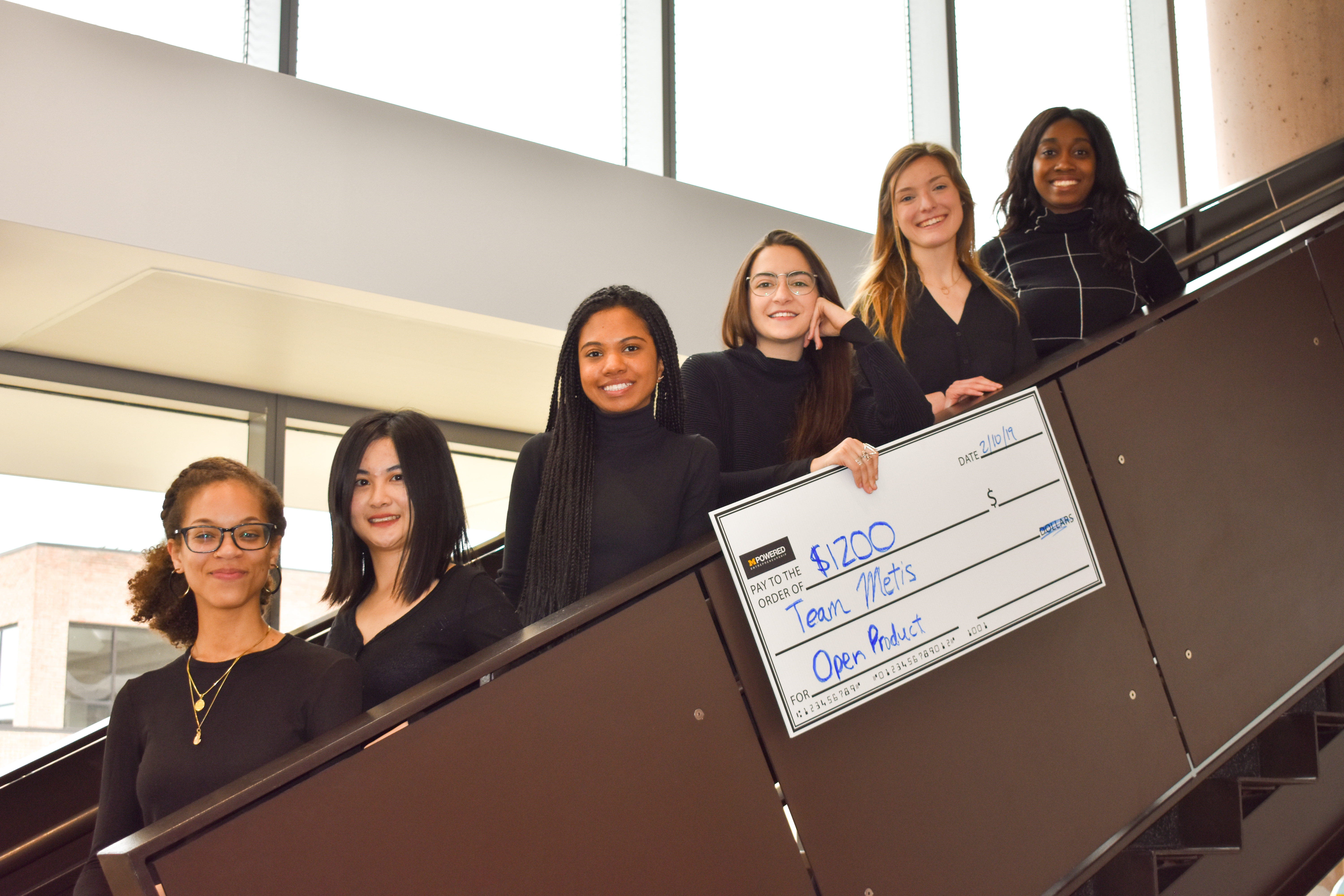
Makeathon's 2019 Product Design Competition gave 52 teams of 5-6 students from many different disciplines the freedom to design and conceptualize a product with 0 restrictions. This year the panel of judges hailed from Autodesk, Amazon, National Instruments, and May Mobility. We placed first for product design and best runner up use of Autodesk's Fusion 360 software.
Product Designer and UX/UI Designer
Winter blues got you down?
College can be a stressful time in a person's life due to the intense pressure to acheive. Students all over the world face these pressures but students in colder climates have to endure long winters and low levels of sunlight being even more prone to those "winter blues". For many college students, poor stress management can lead to a negative impact on physical health with low energy and mood, oversleeping, weight gain, mental health struggles and a decrease in academic performace.

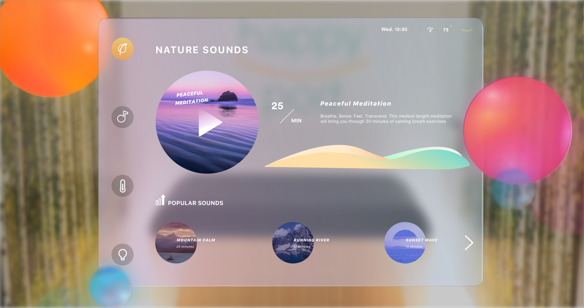
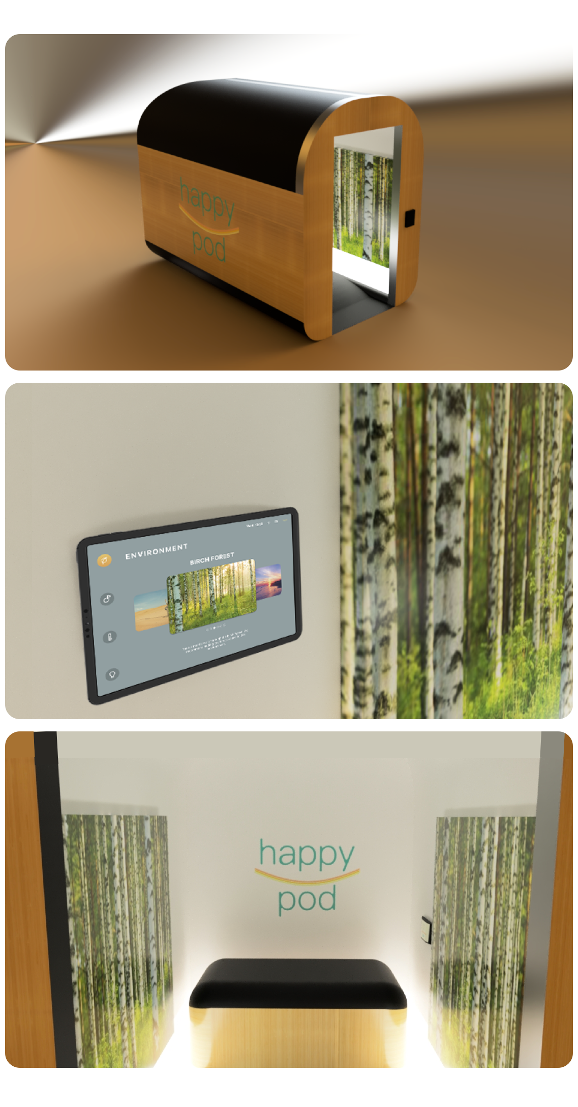
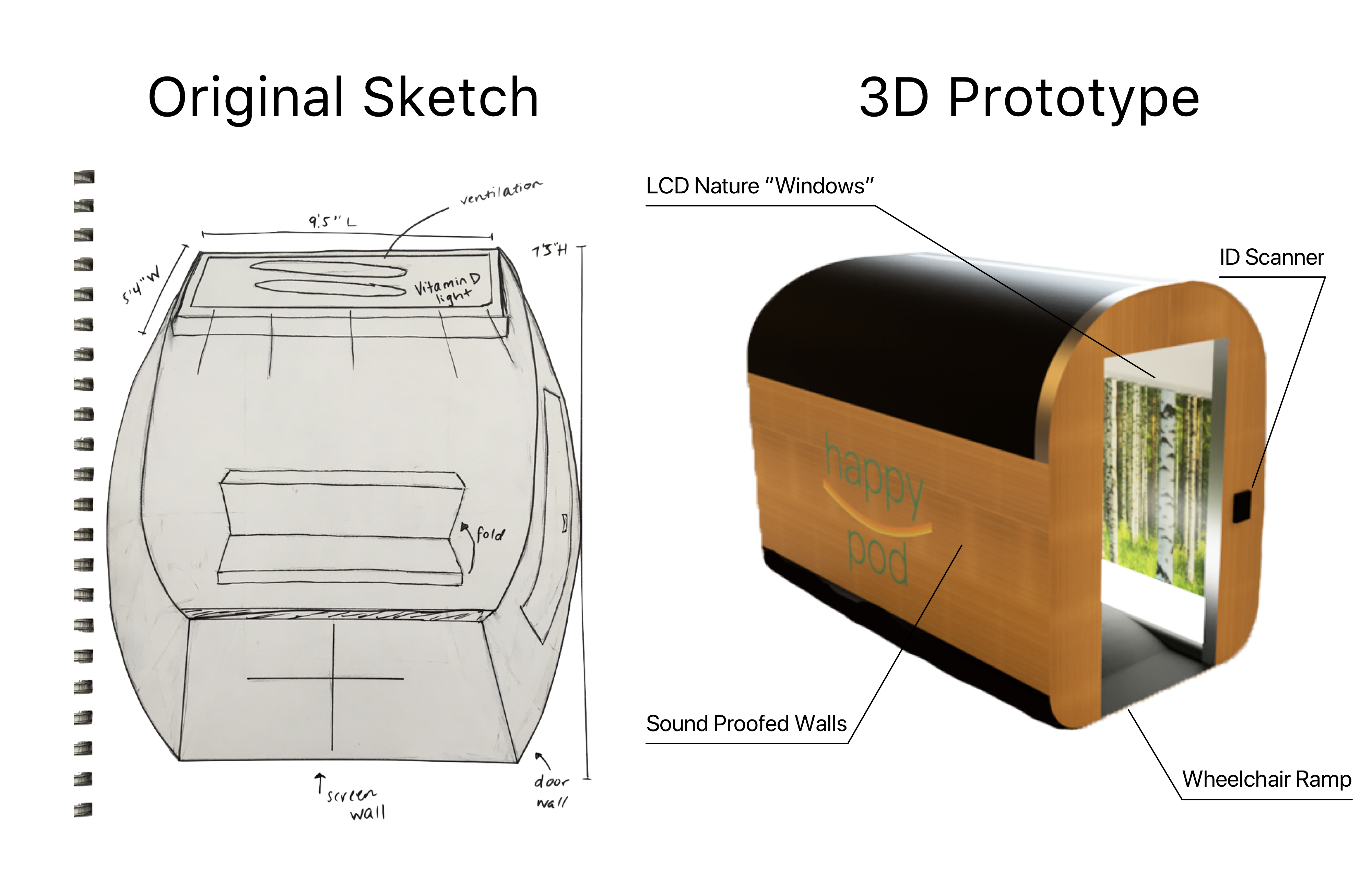
The Happy Pod is a personalized space featuring an interface where users can adjust the temperature, select guided meditations or music, and utilize a vitamin D light while inside the pod.
Students enter the pod with an ID scanner. Their Student ID cards give them access to the personalized, relaxing, and private setting that awaits them.
The walls of the pod are insulated with sound proofed material and metal making it a phone "dead zone". These materials allow for the pod to be private and secluded away from digital distraction.
—LCD nature "windows"
—UV sanitation light cycle
—Smartphone "dead zone"
—Sound proofed walls
—Wheelchair accessible ramp
Our team of 4 UX Researchers conducted a broad competitive analysis in order to look at current offerings around campus for student wellness and stress relief. We looked into a number of competitors like guided meditation platforms, vitamin-D lights, self help books, coloring books and retreat centers.
We used the U of M Counciling and Psychological Services (CAPS) office as our springboard as it provides students a wellness space offering massage chairs and stretching rooms — but with many user pain points.
Current Wellness Center lacks privacy and forces students to schedule appointments by phone in advance.
CAPS Wellness center is open during times that students are in class, not at night when stress commonly sets in.
We used a design process that featured detailed, yet extensive methods to create and filter through ideas without judgement or holds barred. As such, we started by throwing out as many ideas as possible, no matter how far out.
Among our weirdest ideas were a shoulder tickling device to prevent slouching, a natural spectrum light that would activate when recieving a text, and an IOT yoga mat.
We then moved into interviewing 7 potential users to help inform ourselves on what people like, how they de-stress and what they currently use to escape the hustle and bustle of University life. This qualitative information allowed us to build out personas to inform the design of The Happy Pod.
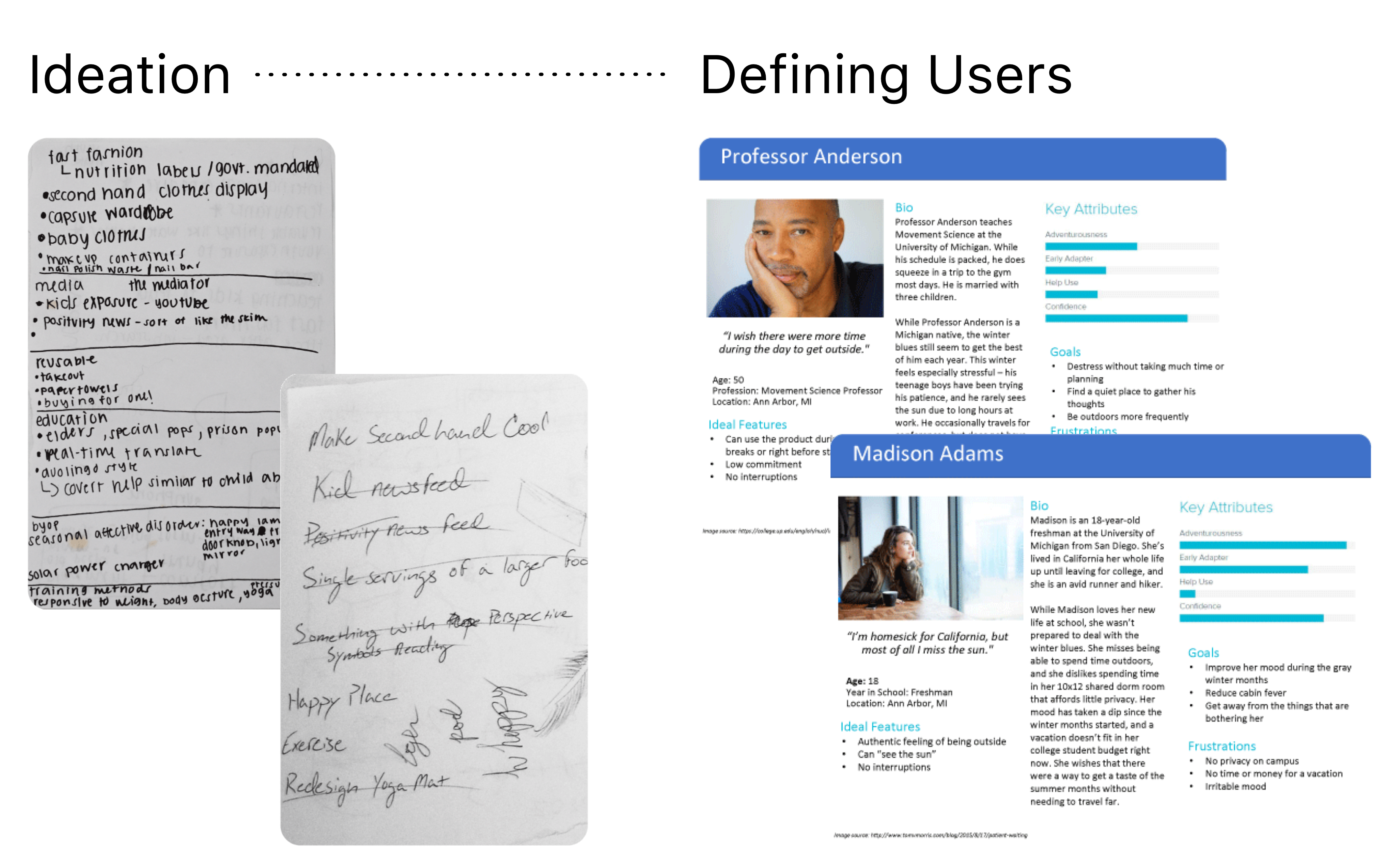
Everyone destresses differently. Some like yoga, others listen to music, nap, get to nature, practice breathing exercises, or less productive ways.
Students lack private space on campus. 87% of students have roommates and lack a private space in which they can unwind.
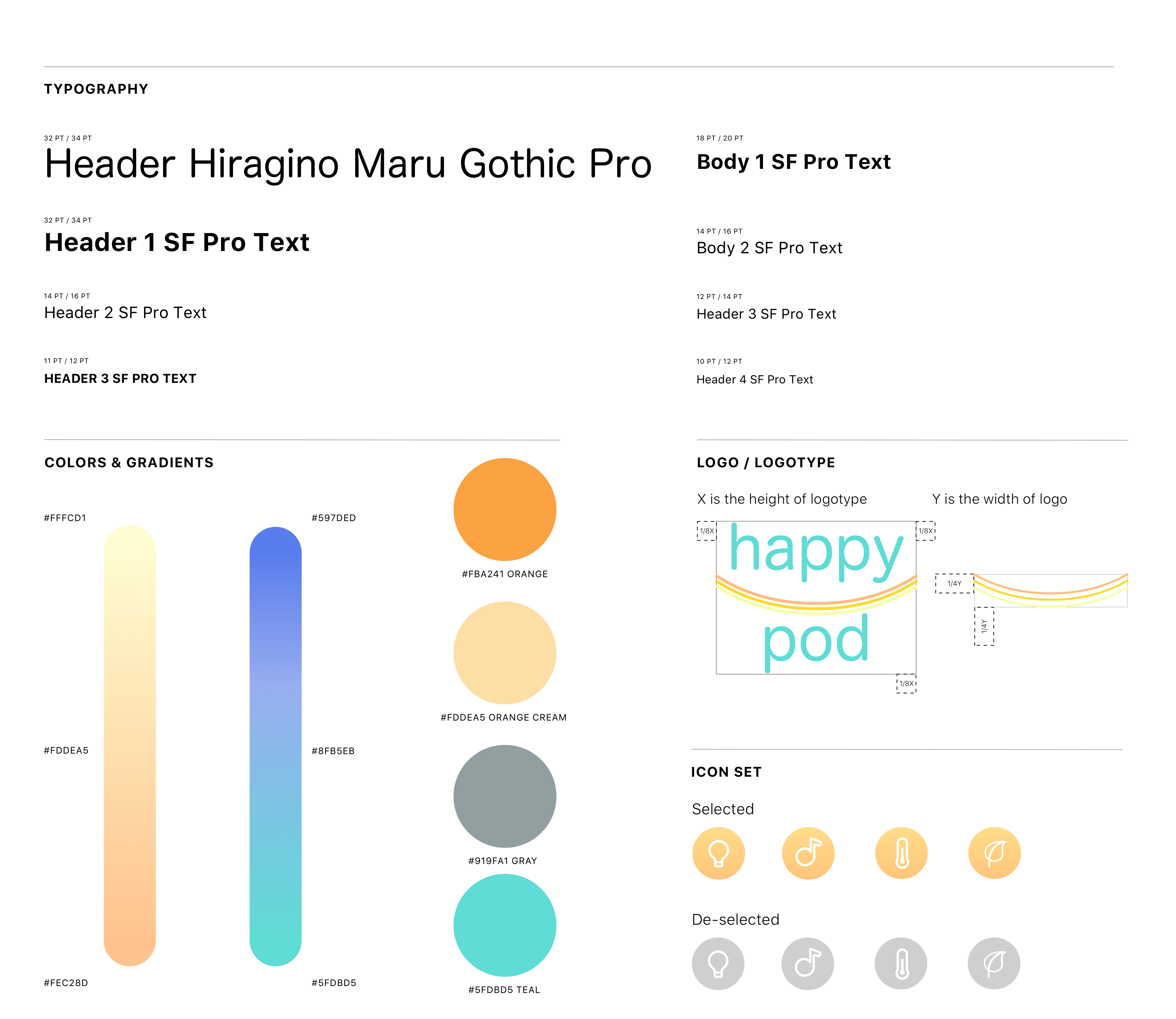
I was in charge of branding for this project. I wanted to use colors in the brand that were bright, inviting and positive. The Happy Pod logo plays off of a smile shape to reflect the name and make users smile. Below is my branding guidelines along with UI font sizes for the control panel on the inside of the pod.
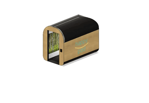
I also took on the task of creating a 3D product model. Prior to Makeathon, I never had any CAD experience but I taught myself how to design, prototype, and render a 3D model in under 36 hours (with thanks to LOTS of coffee). Our team won first place but on top of that, my 3D prototype with AutoDesk's Fusion 360 software won us an additional prize for best runner up use of CAD software across all teams in the competition!
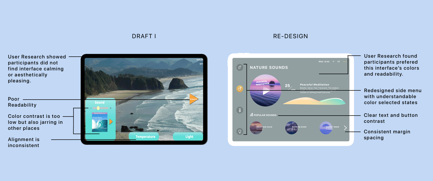
The first draft of the interface was created for the competition by another teammate, but I knew it needed significant improvement as the control panel is the crux of the Happy Pod experience.
I went back and iterated the design based on insights from user testing and leveraging the standardized visual guideline I created during the competition along with Apple's Human Interface Guidelines.
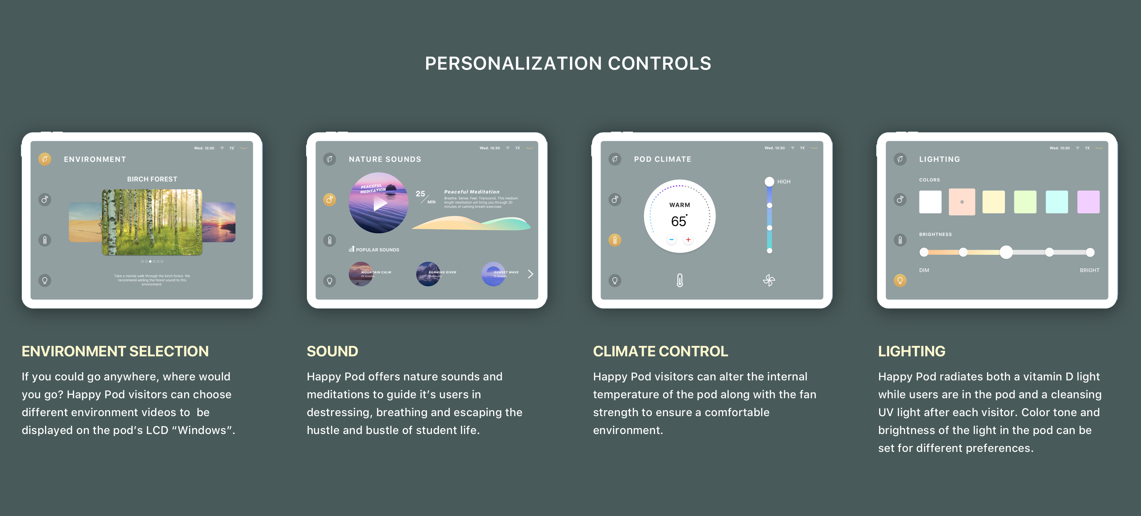
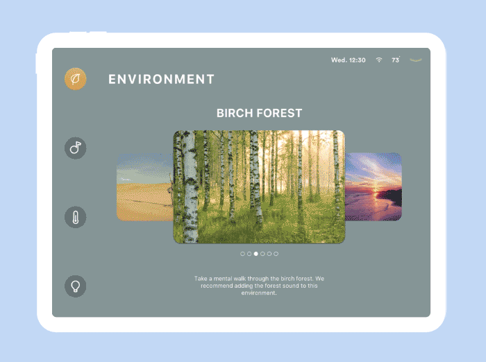
If you could go anywhere, where would you go? Happy Pod visitors can choose different environment videos to be displayed on the pod’s LCD “Windows”.
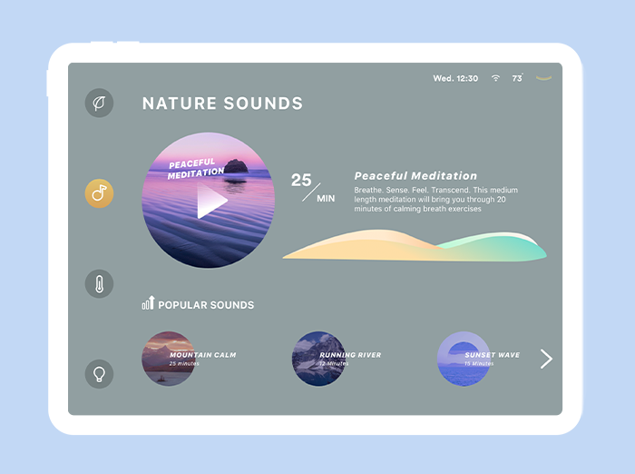
Happy Pod offers nature sounds and meditations to guide it’s users in destressing, breathing and escaping the hustle and bustle of student life.
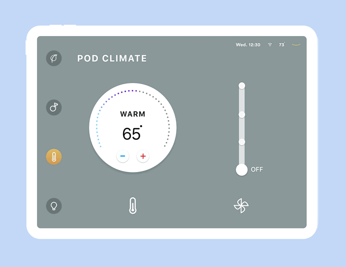
Happy Pod visitors can alter the internal temperature of the pod along with the fan strength to ensure a comfortable environment.
Happy Pod radiates both a vitamin D light while users are in the pod and a cleansing UV light after each visitor. Color tone and brightness of the light in the pod can be set for different preferences.

What I learned:
There were 6 people on the team, and working together to produce a cohesive vision required strong communication and open feedback.
As the competition was only 36 hours, we needed to share and critique each others work in real time. Tools like Slack and Google Drive were critical for real time success.
Failing quickly and considering tradeoffs allowed me to think critically about product decisions and make efficient progress under our time constraints.