MapMe aims to improve grocery shopping through pervasive interaction design methods
UI/UX Designer & Prototype Engineer
2 UX Researchers & 1 Project Manager
Where the heck are the pickles??
Not sure about you, but most of my grocery trips now-a-days look something like :
People want to enjoy their shopping experience but become confused and frustrated when navigating grocery aisles in search of items they can’t locate. In our information age, ethically applying ubiquitous computing and sensor based technologies to the grocery experience could save users time and money while enhancing efficiency.

How might we design a mobile app to help patrons explore and easily locate items in store?
In order to address the common problem of complex layouts and option overload at the store, we designed a mobile app to help grocery patrons easily explore and locate its variety of items.
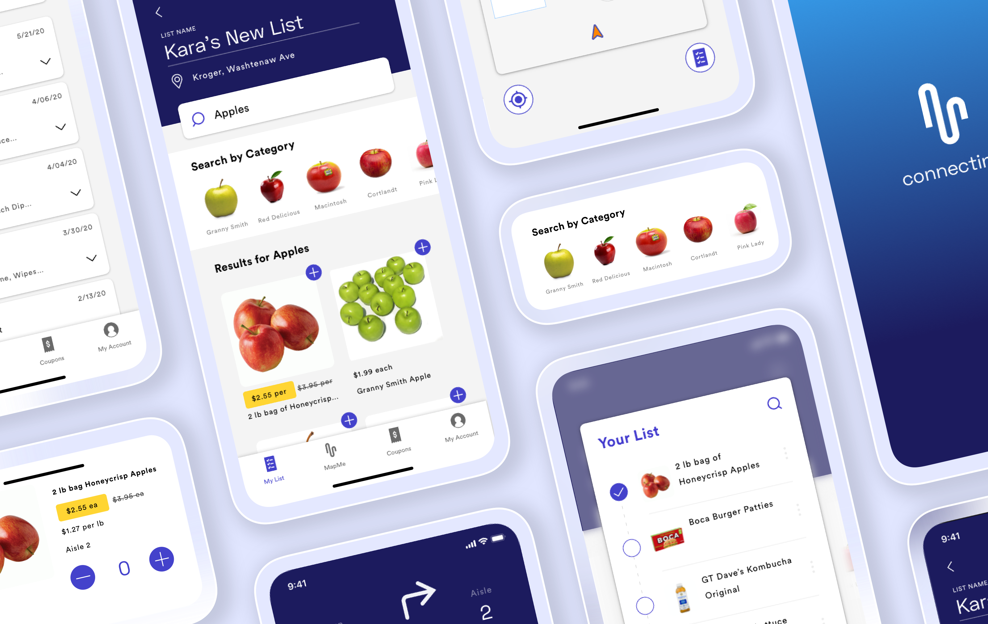
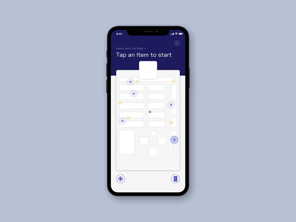
In the MapMe application, list creation not only acts as a way to organize a grocery trip, it’s also used as a means for navigation. We centralized our design around the list because nearly 85% of our research participants brought either a physical or digital list to their grocery shop.
The list gives users the freedom to add items they’re both familiar and and unfamiliar with even before they step into the store.
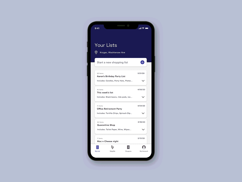
All of our users noted that they preferred using their own device at the store.
Users simply scan the Cart’s QR code via their own smartphone camera. Scanning the QR code initializes the backend of the MapMe system, anonymizing the user and protecting their privacy.
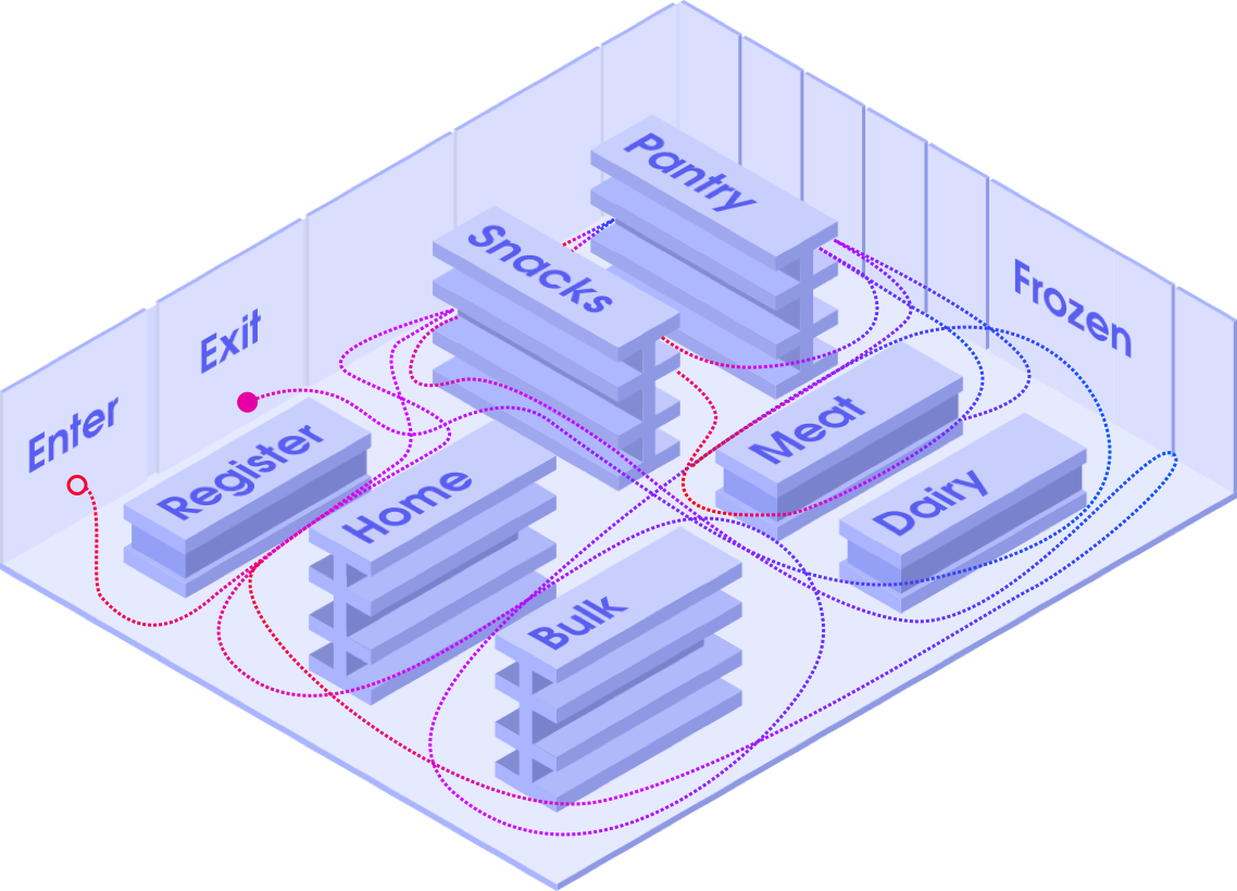
Users can select the items directly from the map to navigate to.
This form of navigation gives people the control of their shopping experience.
Our users wanted to see discounted items when navigating through the aisles or on-sale alternatives to what’s on their list. These are noted in yellow.

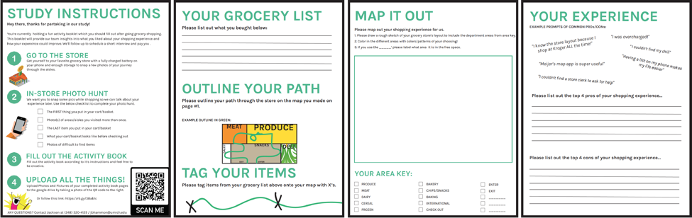
User Observation / Interviews
User Enactments
Cultural Probe Exercise
Online Research
Heuristic Analysis
Analogous Product Analysis
We wanted to think through our potential design space so we initially observed users at 4 suburban Detroit grocers. We wanted to know how and why people moved around aisles so erratically so we leveraged a cultural probe and follow up interviews.
Shoppers had difficulties finding every item or remembering to pick items up along the way, forcing them to waste time and backtrack.
Participants would like to know if something they plan to buy is out of stock.
We listed several research questions regarding interface preference, navigation method, and substitute suggestions to focus our research and better design and experiment with user enactments.
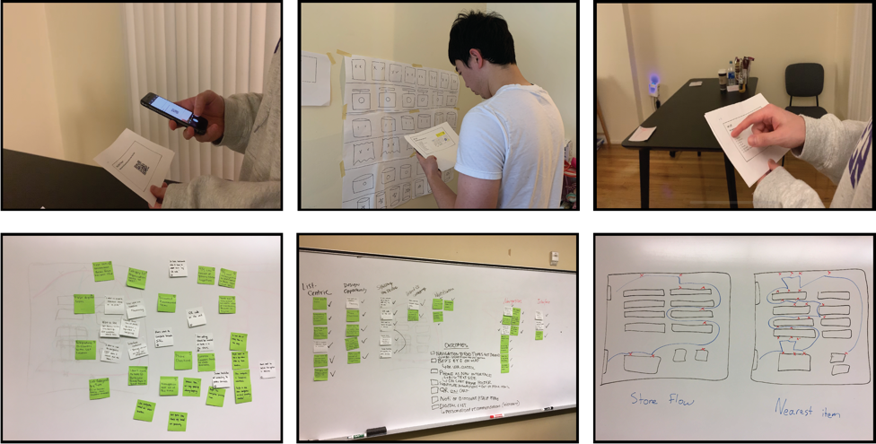
Based on the results of user enactments and notes we collected from the follow-up interviews, we received six key insights, and we chose the two most important insights to inform our key features in our later prototype.
Participants prefer using their own devices with a simplistic birds-eye view of the store, rather than turn by turn navigation directions.
All participants were eager to see a coupon system integrated with the list that offers users personalized sales when in store.
"I always bring my shopping list with me to the grocery store".
A new way to shop.
Based on research, we identified our design opportunity:
How might we design a mobile app to help patrons explore & easily locate items?
With the design opportunity in mind, we moved forward to ideation. We experimented with various methods to display the available items online, visualize the grocery space, and provide visual aids for navigation.
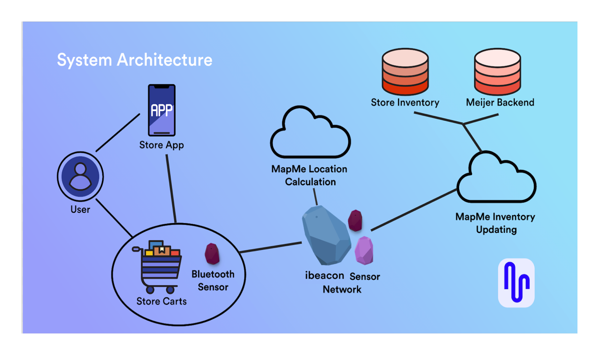
Meanwhile, we also looked into the technical feasibility of our idea. Indoor navigation can be supported through bluetooth beacon technology. The beacon broadcasts a signal in a general area and devices with the associated app can receive location information. Each beacon costs about $40-$60.
"Bluetooth beacons can track your location accurately from a range of inches to about 50 meters
Designing the system
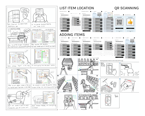
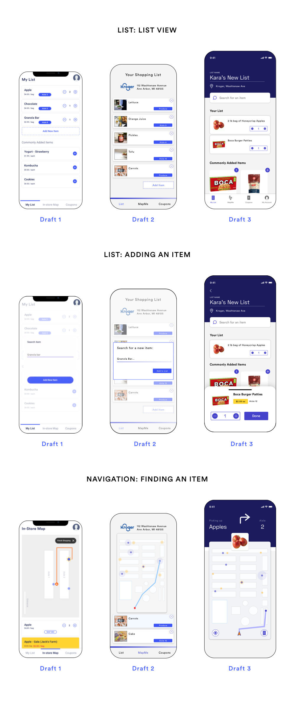
After ideation, we decided on 4 main features for our app: Home, Map, coupons, and Profile. Below is an overview of my building and refining process for the two main flows:
Explore the grocery store by list
Navigate to a specific item in map
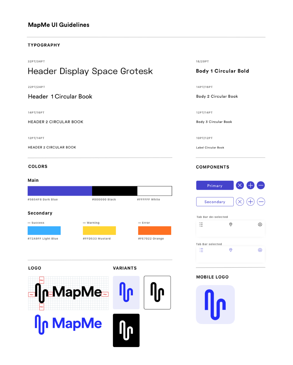
The first step of prototyping was to create a visual style guideline that is shared across our app. The visual style aims at creating a calm, open and clean personality while also honoring the original branding of our target store, Meijer.
After setting the visual guideline, I created prototypes and iterated the design based on insights from user testing.
We had to make sure that the current design could be supported by existing store infrastructure. This graphic explains how information should be exchanged between user and the store’s inventory via beacons.
What I learned:
I learned to use methods such as shared to-do-lists and critique documentation to organize the team's progress and improve efficiency.
I matured my skill to assertively communicate with my team in a timely manner and address disagreement with mutual compromise.
I learned to fail fast and give bold ideas that seem to be challenging but potentially fruitful a try, even if success doesn’t come at first.
Trying my hand at C++
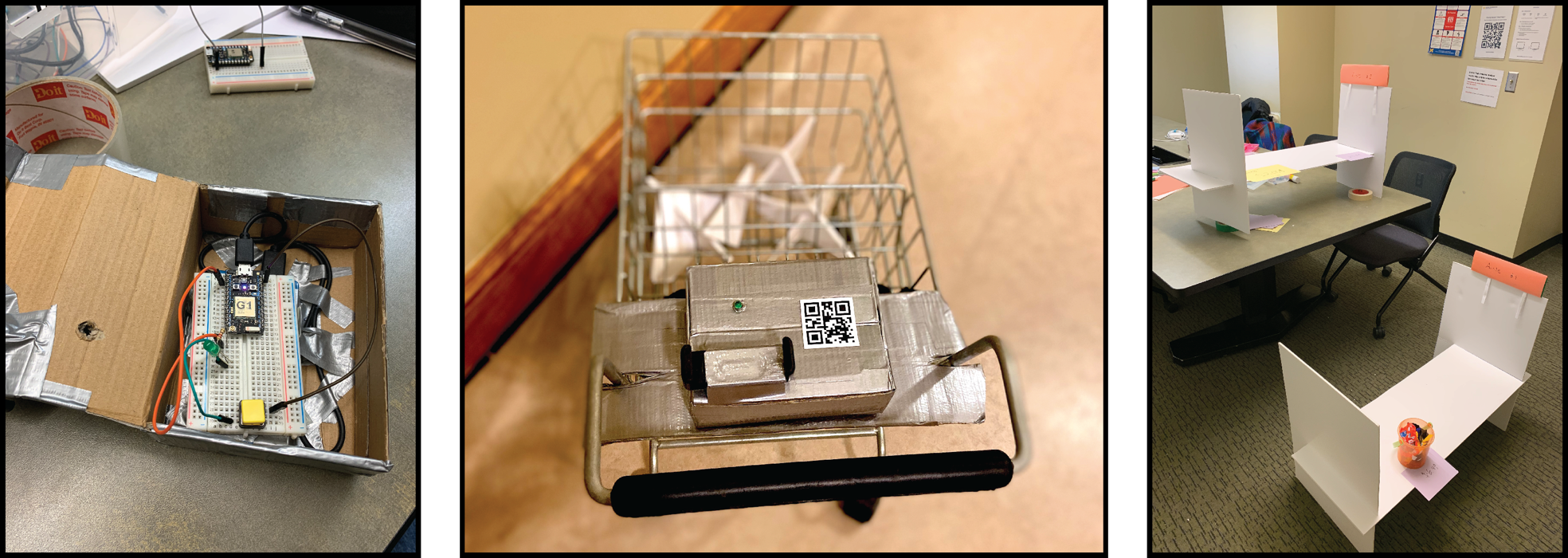
We had to meet specific computer hardware requirements for our prototype. As product designer and engineer for my team I decided to use a particle photon microcontroller for the wizard of oz experience. The photon is placed in a box on the shopping cart where I wrote C++ code to turn the LED light green when the QR was scanned, signaling a successful connection to the beacon network.
The below video gives an overview of use with our mid-fidelity mobile design.
Where to improve:
I would like to conduct more user testing and iterate on the map design including the label and graphics.
Privacy remains a concern with a system like this. This data in the hands of advertisers and stores could be used in a malevolent way. We gave users a clear and explicit way to disconnect their phone from the grocery cart, but users can also be tracked every step of the way through the store via the cart. Further research is required to see how much this bothers our target users.