PRODUCT DESIGN, USER RESEARCH —
Improving DICK'S Sporting Goods buy online pickup in store experience through human centered design
MY ROLE
Product Designer
THE PRODUCT TEAM
3 Software Engineers
1 QA Engineer
1 Systems Specialist
1 Product Manager
Improving DICK'S Sporting Goods buy online pickup in store experience through human centered design
Product Designer
3 Software Engineers
1 QA Engineer
1 Systems Specialist
1 Product Manager
Our fulfillment goal at Dick's Sporting Goods is to ensure customer orders are delivered as quickly as possible so our customers can get playing faster! During our product discovery we uncovered that hundreds of our in store associates had difficulties in locating customers for in store and curbside delivery which caused wasted time and customer frustation.
Human centered design methods guided our refresh of the web based pickup experience for both customers and Teammates alike.
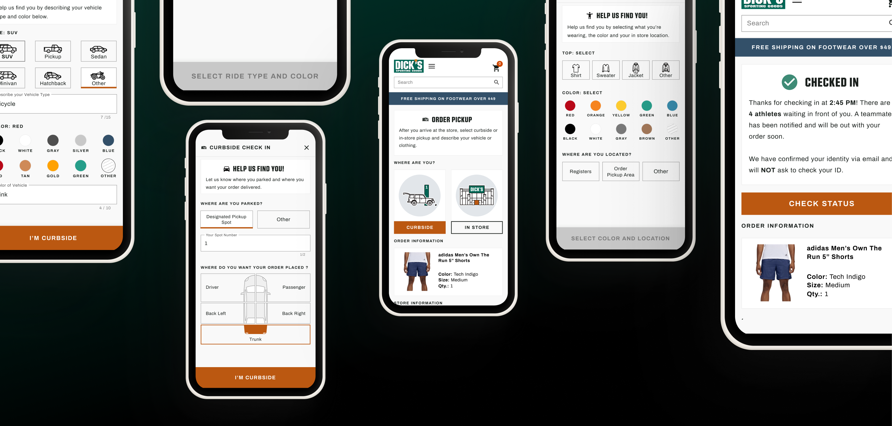
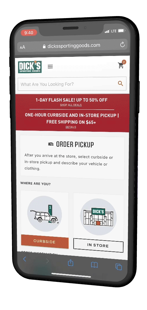
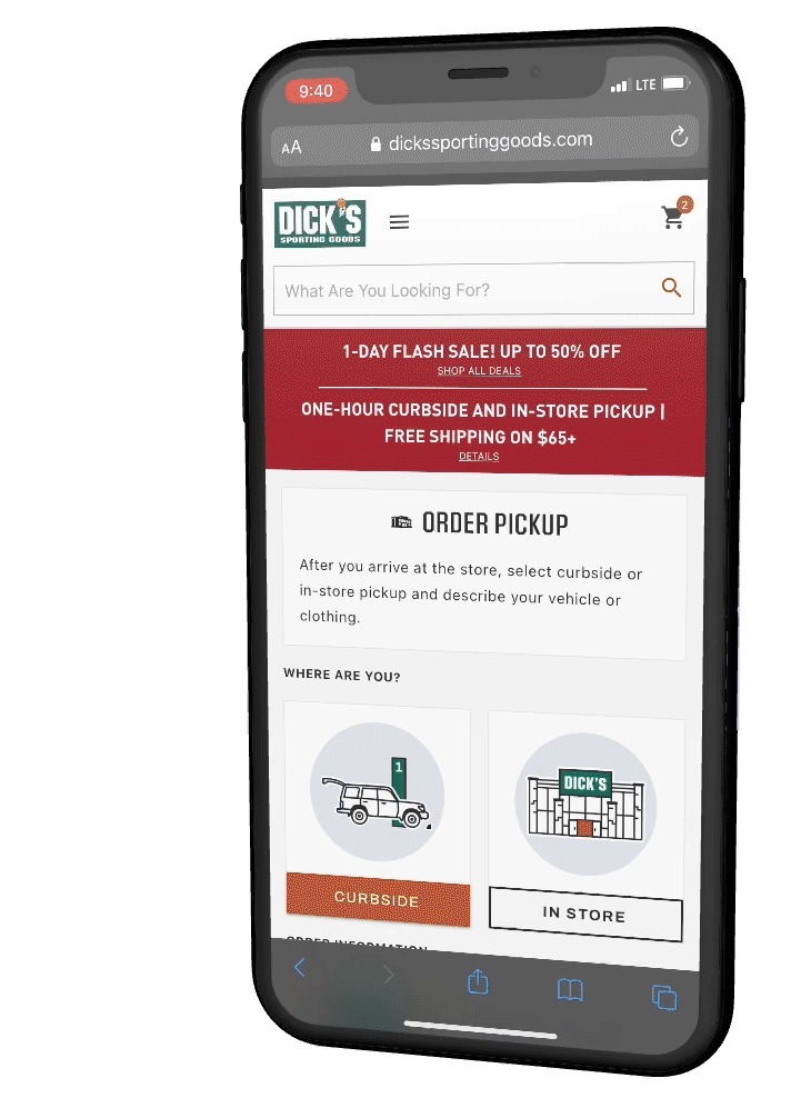
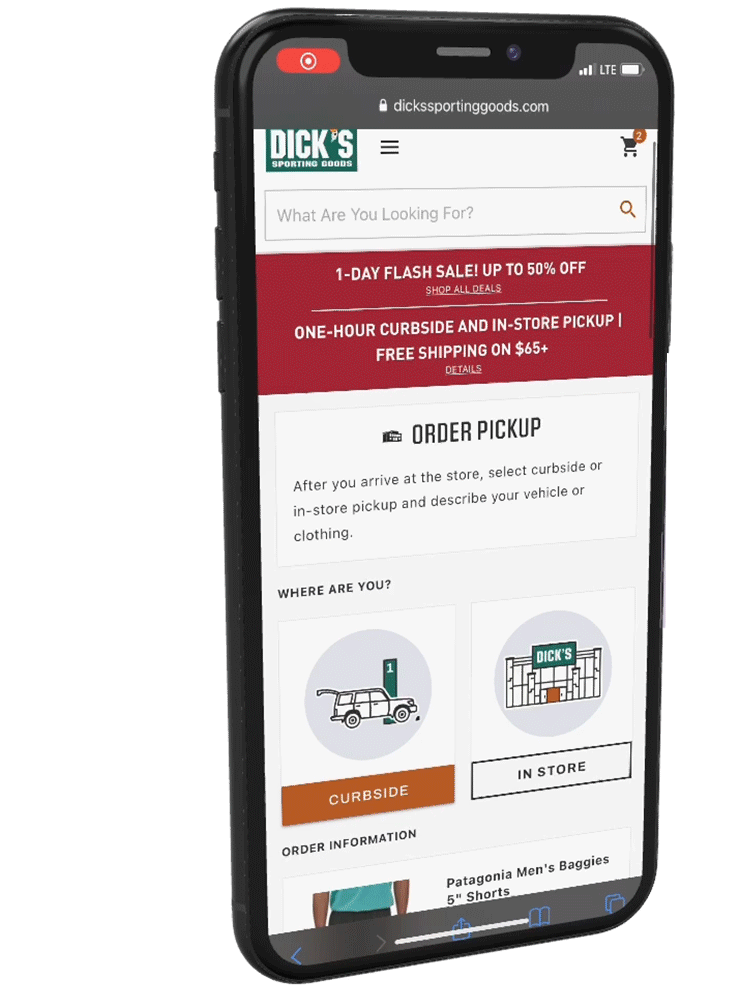
The refreshed pickup experience live at DSG today features amusing, guided inputs to gather more consistent information from customers on their whereabouts when they arrive at the store to pickup their online order.
The refreshed design provided store teammates with consistent, useful data to locate and deliver quicker and more efficiently; ultimately decreasing store delivery speed by 1.8 minutes on average which over the course of the year translates to 2 million dollars in reappropriated labor... and so many less headaches!

How might we assist store teammates in locating pickup customers?
What in the world is a BOPIS order?
At DSG, stores mainly fulfill two types of orders, SFS orders which stands for "ship to customer from store" and BOPIS Orders, "buy online pickup in store". My team, the FIT ( Fulfillment Innovation Technology ) Team owns both the fulfillment application used by store teammates to pick and pack SFS and BOPIS and deliver BOPIS orders to customers who check in for pickup with our team's web based check in experience.
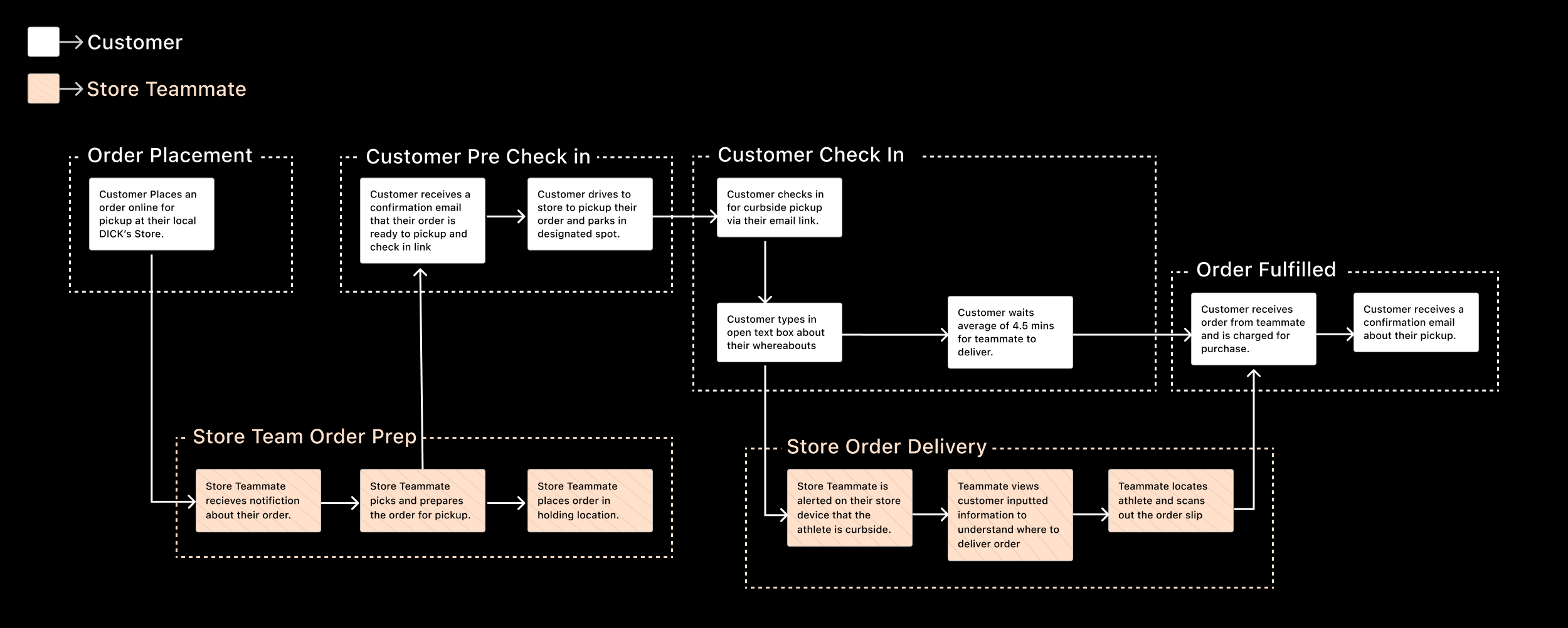
To create a shared understanding in order for you to review this project, I created a very high level User Journey to showcase the core steps involved for both of our team's end users (Customers and Teammates).
1. Order Placement
2. Pre-Check In
3. Check In
4. Fulfillment
1. Store Order Prep
2. Store Team Delivery
One of our largest outcomes for the year was to decrease the wait time for pickup customers; less waiting time = happier customers = more $$! We can only ever be as fast as our slowest processes, so we needed to uncover the bottlenecks in our teammate's delivery process when a customer checks in to pickup their order.
I’m HUGE continuous discovery fan. Every other month I send out a pulse survey to our 900+ retail locations on new feature feedback, pain points and their ever changing needs. We started to notice a common pain point where teammates couldn't easily find or locate customers for store pickup! My team and I thought this would be a great space to start exploring.
All stores use our technology to fulfill orders so in order to learn from expert users, I simply need to walk into a store and ask the right questions. My focus for the contextual inquiry series was to understand what was causing the inability for teammates to locate customers.
It became VERY apparent after watching less than a dozen pickups at various stores that the information inputted by athletes on our check in web page was inconsistent and confusing to teammates. This caused our teammates to waste time looking for customers in incorrect locations causing teammate AND customer frustration.
What's your input on Inputs?
Based on research, we identified our design opportunity:
How might we assist store teammates in locating pickup customers?
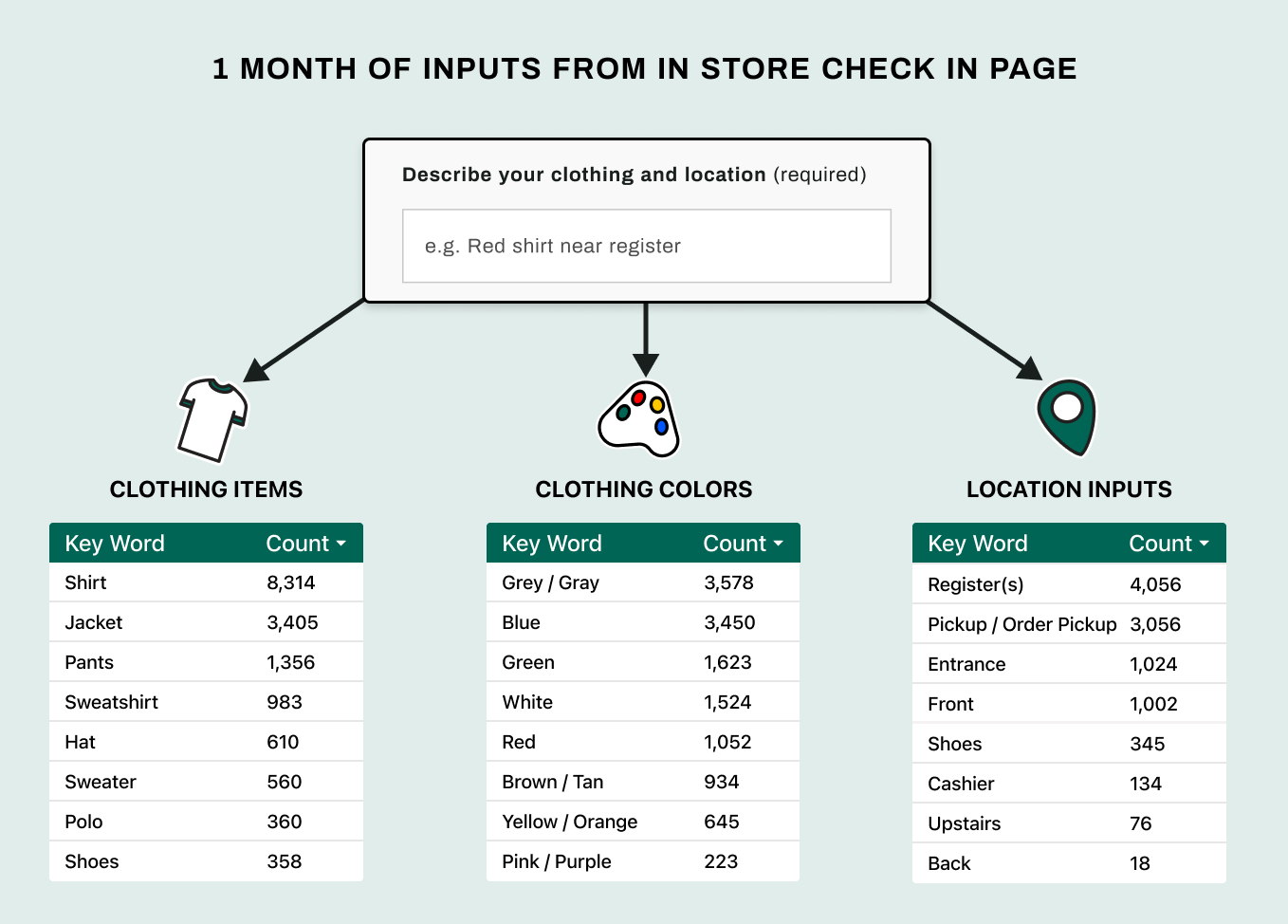
At this point in our process we knew the issue of customer findability was widespread. My team and I pulled a month’s worth of data from both our curbside and in store check in page inputs for deeper analysis. We wanted to understand what information customers were providing and what we were ultimately displaying to teammates on their store devices.
Below are a select few inputs which highlight how unhelpful some of the inputs teammates would use to locate athletes were. It's no wonder why teammates found it difficult to locate customers at check in.
It was very apparent that although there were many unhelpful input outliers like in the image above, there was an overarching commonality that we could leverage in the re-design when we dug in deeper and quantified the key terms used. This data was the core driver in the redesign of the check in flow so we could leverage terms and descriptors that athletes were already providing.
The image below showcases the count of keywords over a one month period of use live on the DSG check in page.
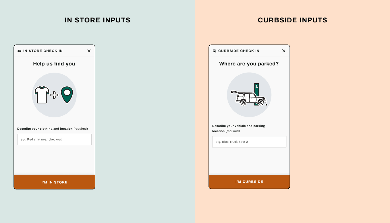
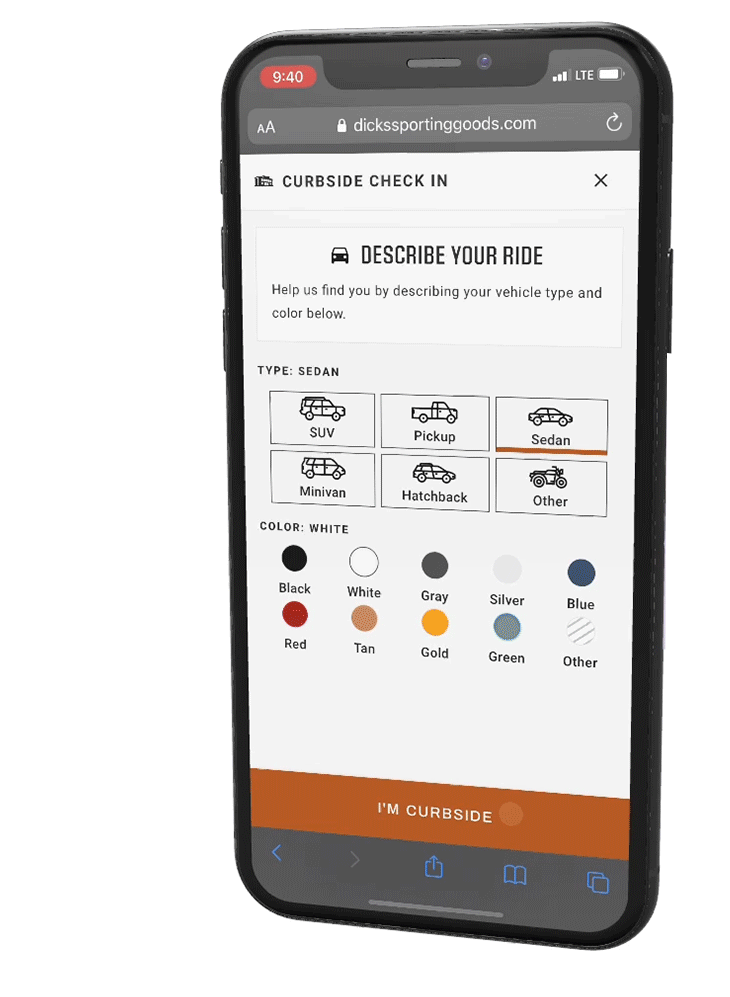
Leveraging the information learned from the quantitative deep dive, I designed a lo-fi user flow for customers to check in and provide more accurate information so we could better assist the consumers of the inputs - our store team in charge of locating customers for delivery both curbside and in store.
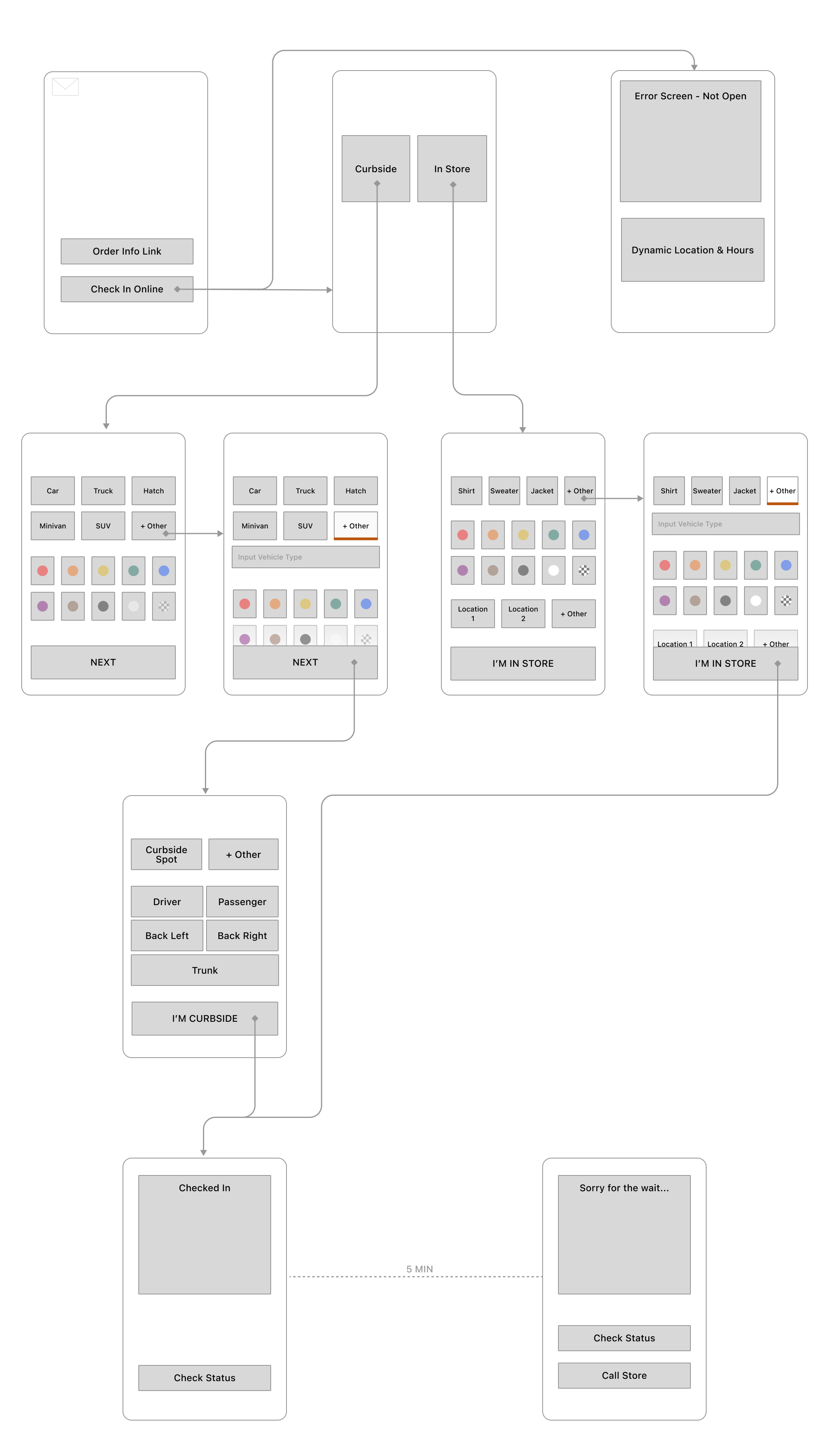
Based on the quantitative analysis, We learned that the most common clothing items athletes inputted were tops. We included an "other" option for customers who were wearing other articles of clothing.
The color button options were the top 9 colors athletes used over the month long data collection. Pink and Purple were the least popular colors and can be represented by the "other" button.
We included the top used in store locations which were registers and the order pickup area. 95% of Athletes now use either the "Register" or "Order Pickup Area" buttons since launch.
When reviewing the vehicle inputs, we found them to be very model specific. That was not conducive to a streamlined set of buttons. We modeled the button selection off of published research on the top vehicle types used by middle class American families. When selected the "other" button drops down into a text field to support input for any outliers.
Similarly the colors represented are the most common car colors in the United States with an "other" option as well.
The majority of our store locations have curbside spots for pickup customers to park. These are all numbered with a sign that displays the curbside spot number for customers to input. The "other" button allows for other parking lot layouts that might not meet the standard like mall garages.
In the midst of the pandemic, we recieved a lot of feedback from customers that wanted to be able to specify where the order was placed for a contact free delivery. This feature came at just the right time when the Delta variant was on the rise and has since made delivery safer and more straightforward for our store teammates who are delivering orders. The Order Placement buttons were my favorite UI Elements to design since joining DSG! They were a fun challenge to perfect in development as well!
Results & Impact:
The second half of this redesign was how we incorporated the new streamlined button selections into our store's teammate facing application which my team also owns. Due to my NDA, I'm not able to share any metrics, information or internal facing application screens. If you're interested in learning more about that half of the re-design, please reach out to me directly!
The refreshed design provided store teammates with consistent, useful data to locate and deliver quicker and more efficiently; this ultimately decreased store delivery speed ( our main KPI ) by 1.8 minutes on average which over the course of the year translates to 2 million dollars in reappropriated labor... and so many less headaches!
After Launch, we saw CSAT scores increase due to the lower wait time and several dozen comments around the new order placement feature being extremely convenient during curbside check in on our customer survey.